
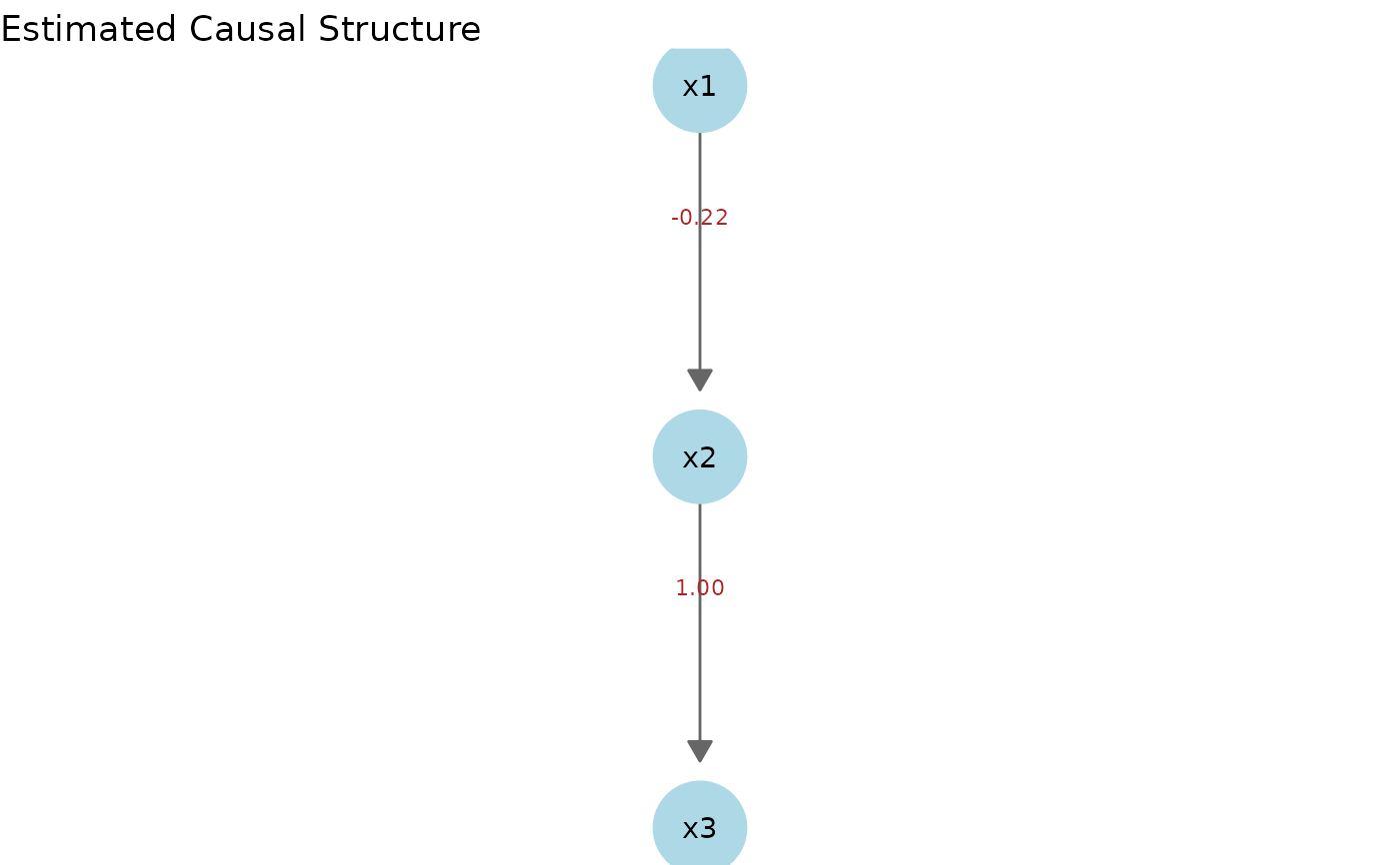
Draws the estimated causal structure of a LiM model as a ggplot2-based
directed graph, exactly like autoplot.LingamResult().
Usage
# S3 method for class 'LiMResult'
autoplot(
  object,
  threshold = 0,
  node_size = 16,
  node_color = "lightblue",
  label_edges = TRUE,
  label_pos = 0.35,
  ...
)
Arguments
- object
Return value of
lingam_lim()(aLiMResultobject)- threshold
Coefficients with an absolute value at or below this are not treated as edges (default: 0)
- node_size
Node size (default: 16)
- node_color
Node fill color (default: "lightblue")
- label_edges
Whether to display coefficient labels on edges (default: TRUE)
- label_pos
Position of each coefficient label along its edge, as a fraction from the source (0) to the target (1). The default 0.35 places labels off-center (toward the source) so labels on crossing edges do not overlap near the midpoint.
- ...
Unused
Examples
# \donttest{
if (requireNamespace("ggplot2", quietly = TRUE) &&
requireNamespace("igraph", quietly = TRUE)) {
library(ggplot2)
set.seed(1)
dat <- generate_lim_sample(n = 300)
model <- lingam_lim(dat$data, is_continuous = dat$is_continuous)
autoplot(model)
}
 # }
# }